

How to show or hide block on a mobile device?
Last updated October 14, 2024
You can show or hide a block in a template based on the device on which the email is being opened i.e. desktop or mobile.
For example, I have a button in my template that redirects to my Play Store app. This button is only relevant for mobile users. With the hide feature, I can hide this button for email recipients viewing the email on a desktop as it will only be visible on mobile devices.
Prerequisite
1. This feature is only applicable to blocks and forms. The feature is not available for widgets.
2. If the width of the device on which the email is being viewed is less than 480px, then the mobile version will be shown. If the width is more than 480px, then the desktop version will be shown.
Show / hide functionality may not work on certain version of Yahoo and Outlook email clients. So, please remember to test the email on actual devices before sending the campaign.
How to hide a block based on the user’s device type?
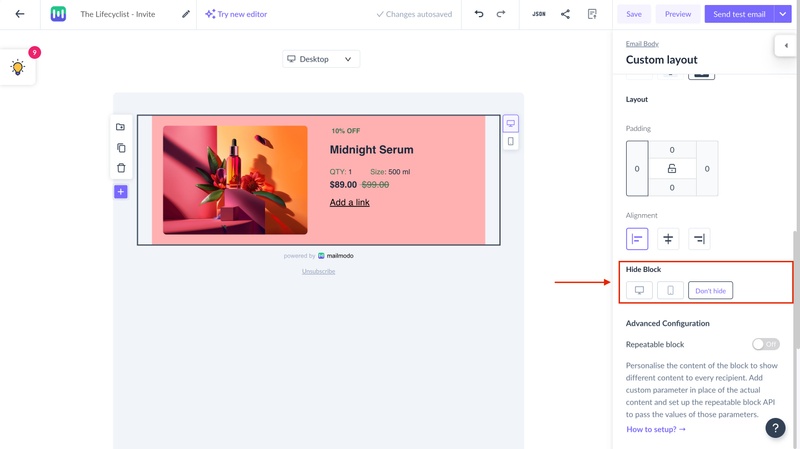
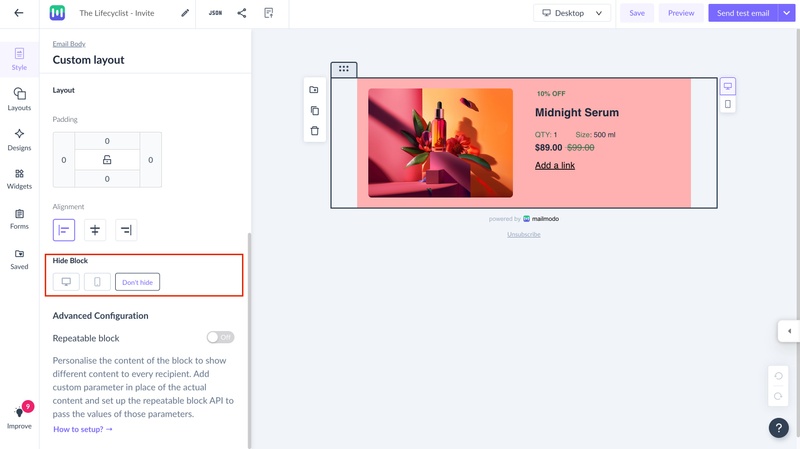
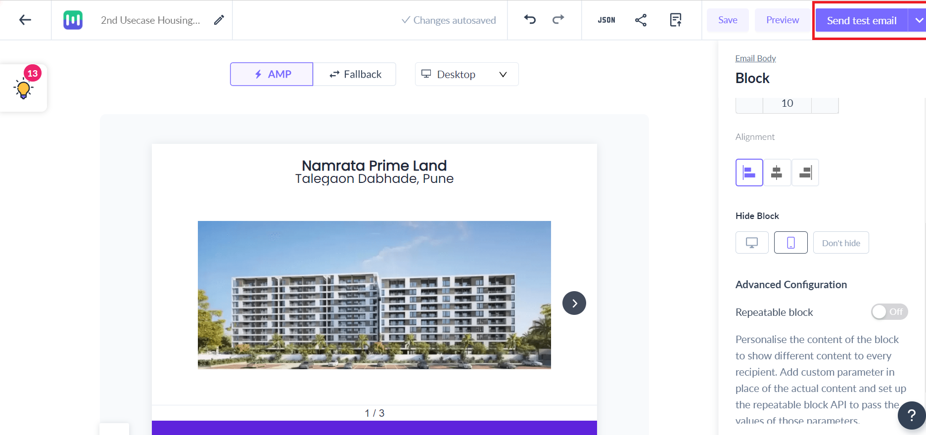
Step 1: Select the block or form you want to hide. Scroll down on the right panel (old editor) or left (new editor) to find the hide feature.
Old editor
New editor
Step 2: By default, the block is shown on all devices. Select the device on which you want to hide the block/form.
In case of forms, you need to configure the AMP and HTML version separately.
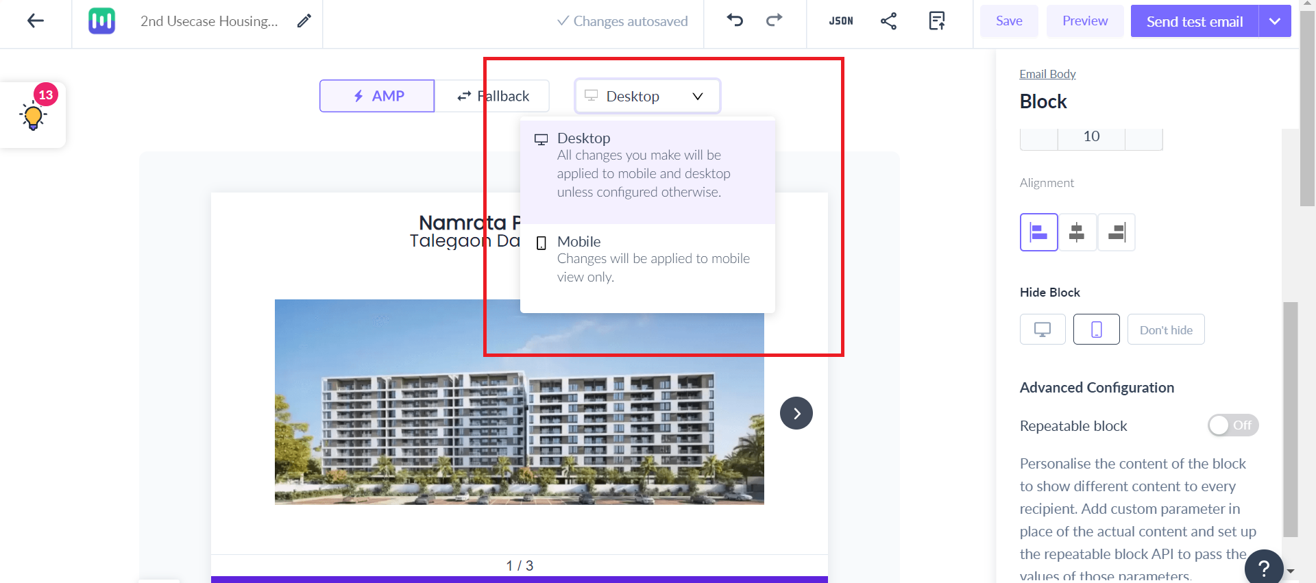
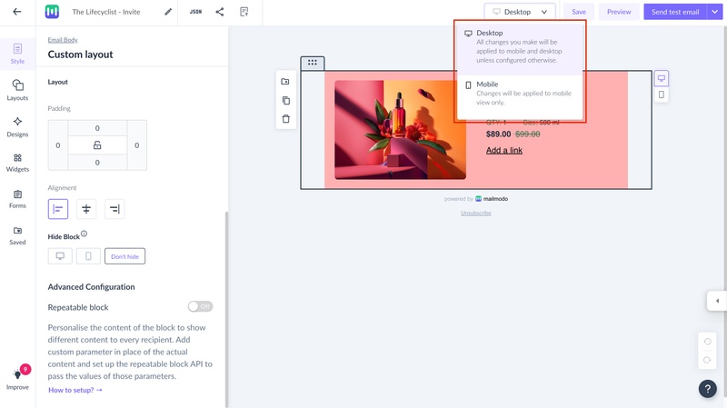
Step 3: Once configured, check the template preview. You can toggle between the desktop and mobile versions from the drop to see how the template will look on different devices.
Old editor
New editor
Step 4: Send a test email to see how the template will look in the user’s inbox. Be sure to check the email on both desktop and mobile devices.
Use the search bar in our Help Center to find quick guides and walkthroughs. If you have any queries, then reach out to us at Mailmodo Support or share your thoughts at Mailmodo Product Feedback.