

How to customize your email template for mobile devices using the no-code email editor?
Last updated July 15, 2024
On desktop devices you have more screen space to work with, so you can optimize your email template for a comfortable reading experience, maintaining white space and establishing a clear hierarchy between different blocks and elements. However, on mobile devices, you have limited screen space to work with. You need to optimize the layout to ensure content is readable without excessive scrolling, while also maintaining large touch targets for buttons, links, and other interactive elements. In this article, we are going to learn how to create mobile-friendly templates on Mailmodo’s no-code email editor.
Why should you optimize your email template for my mobile devices?
- Mobile is the most popular reading environment, with 44.7% of the share. - The 2021 State of Email by Litmus .
- If your emails are not optimized for mobile, it will affect your email metrics - lower clicks, conversions, ROI, and higher unsubscribes.
- Lower brand reputation, as you are not providing users with what they expect from your brand.
Further reading: 11 Must-Know Mobile Email Design Tips to Keep Your Subscribers Happy
Overview
In this article, we are going to learn how to-
- Opt imize multi-column layouts for mobile devices
- Scale images for mobile devices
- Optimize block-level and column-level alignment for mobile devices
- Optimizing block-level padding and column-level padding for mobile devices
- Show or hide block on mobile devices
- Different font sizes for Desktop and Mobile
- Preview template across different mobile devices
- Send a test email
Watch out this space for further updates. More mobile customisation features coming soon!
Pre-requisites
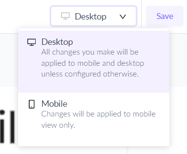
1. If the width of the device on which the email is being viewed is less than 480px, then the mobile version will be shown. If the width is more than 480px, then the desktop version will be shown.
2. All changes made in the desktop view will be applied to mobile view by default unless changed explicitly.
3. Changes made in mobile view would only be applicable to mobile devices and not to desktop.
Optimize multi-column layouts for mobile devices
When to optimize multi-column layouts?
While multi-column layouts look great on desktops, they often affect legibility and make your email look cluttered on smaller screens.
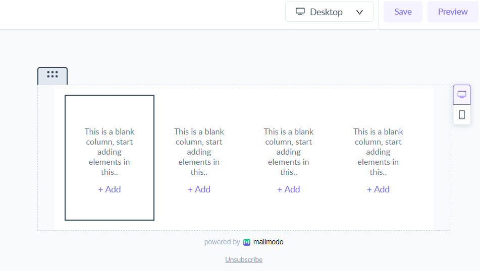
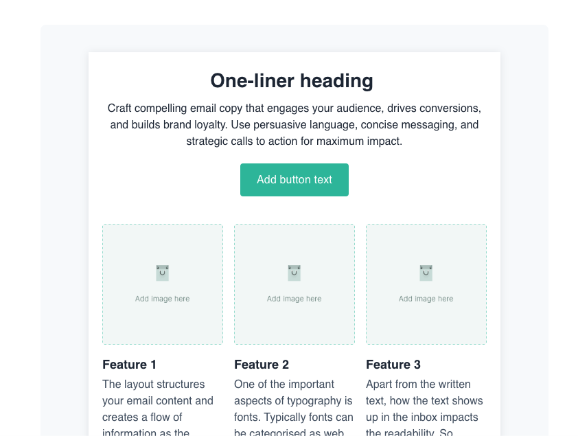
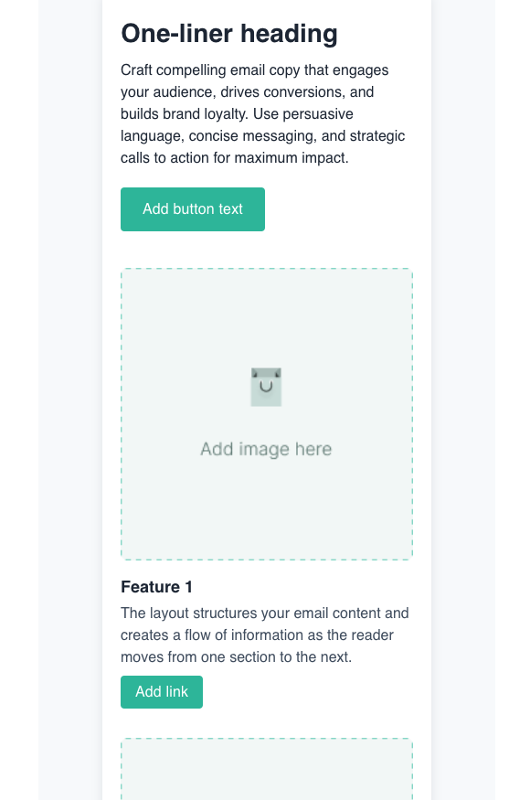
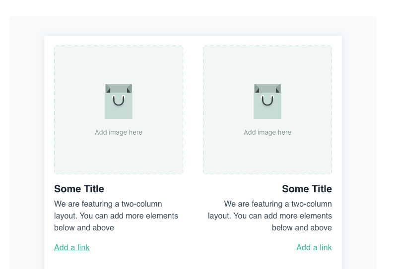
For example, this 4-column layout looks great on a desktop-
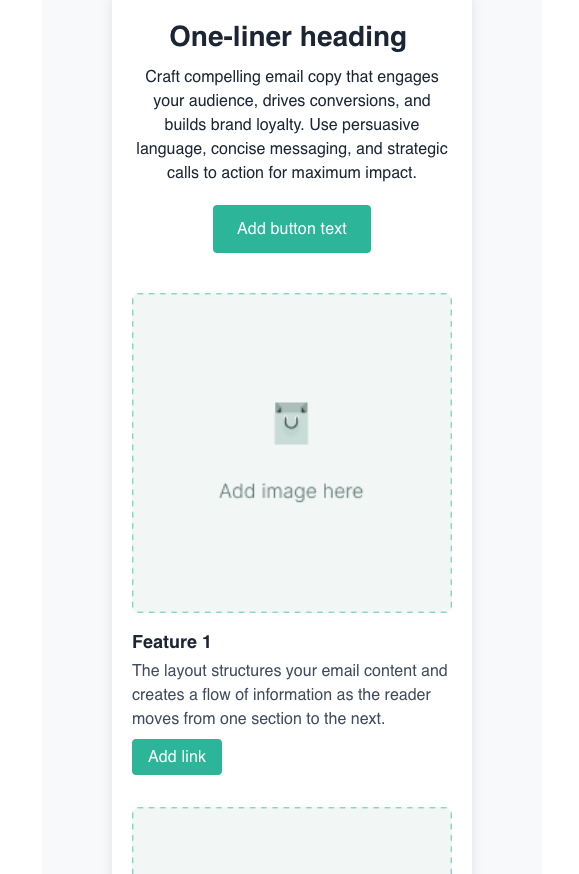
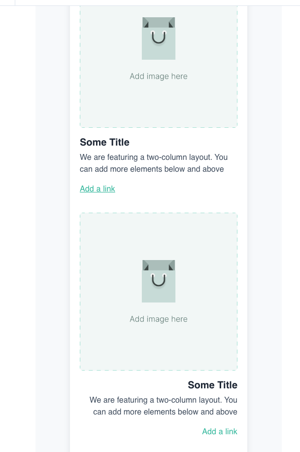
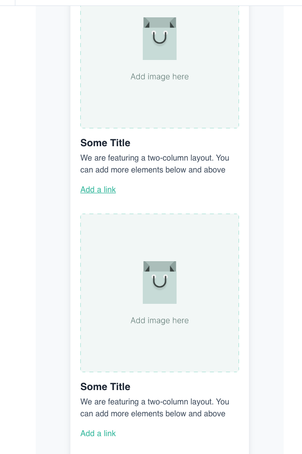
But, this layout does not look good on mobile. Instead, if we used vertical column stacking, here is how the template will look-
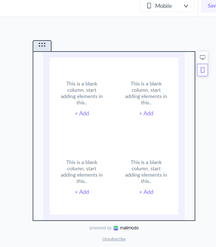
As you can see, vertical stacking gives a much cleaner appearance to your email template.
Recommendation: Use a single-column layout on mobile devices.
How to optimize multi-column layouts?
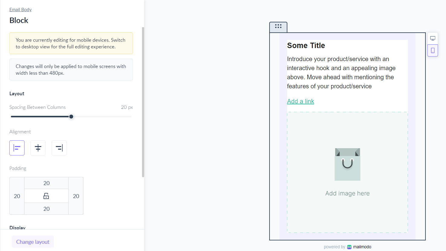
Step 1: Switch to mobile view using the dropdown at the top.

Step 2: Select the multi-column block and select vertical layout from the left panel.
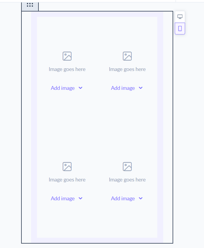
Now your columns will be stacked one below the other on mobile devices instead of appearing parallelly.
Scale images for mobile devices
When to scale images for mobile devices?
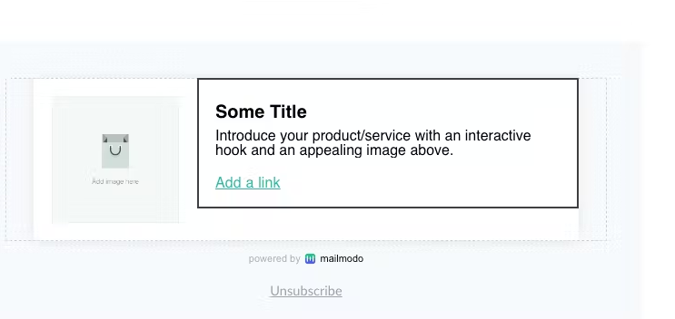
Sometimes a full-width image might look great on a desktop but might not look so good on mobile devices.
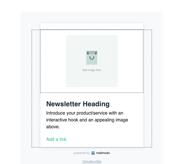
For example, here is how this logo image will look on a desktop.
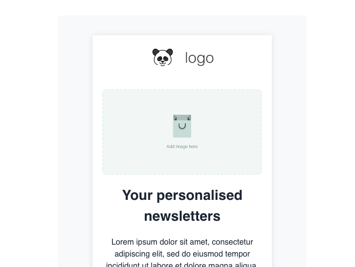
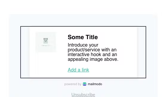
And here is how it will look on mobile.
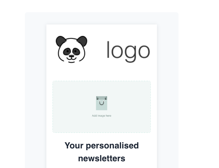
As you can see, the full-width logo does not look very appealing on mobile.
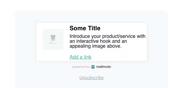
Instead, if the logo image was scaled down, this is how it would look on mobile.
In this case, a scaled-down image gives a much cleaner look to your email template.
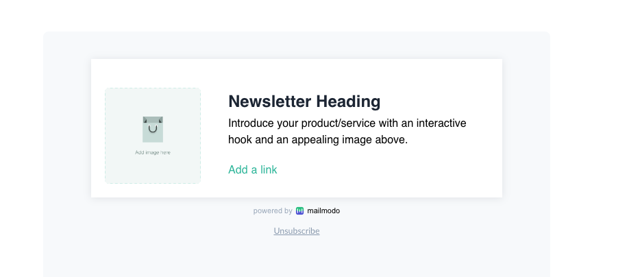
On the other hand, a full-width image might look better on mobile devices in some cases. Let us look at another example below.
This is how the template looks on desktop.
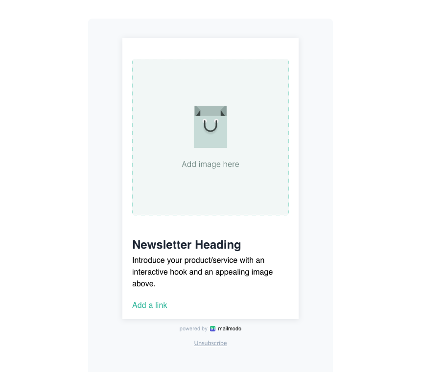
This is how the template will look on mobile with full-width and scaled-down images respectively.
Full-width image->
Limited width image->
In this case, a full-width image looks better than a limited-width image.
Recommendation: While there is no hard and fast rule to choose between scaled-down and full-width images, it is a good practice to test out both versions to see which version looks best on your template.
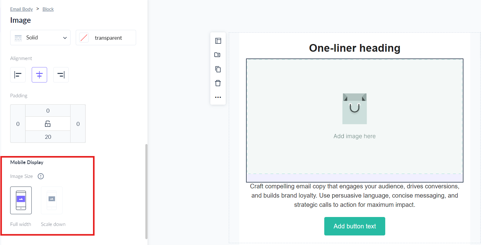
How to scale images on mobile devices?
1. Select the image in the desktop view.
2. Scroll down in the right panel and choose one of full width or limited width. The selected configuration will be applied on mobile devices only.
Optimize block-level and column-level alignment for mobile devices
When to optimize block-level and column-level alignment for mobile devices?
Certain layouts like zig-zag or pyramids might require different alignments for different blocks.
For example, in this template, the first block is center aligned and the second block containing multiple columns is left-aligned.
While this looks great on desktop, the template looks misaligned on mobile devices. The text of the first block is center aligned while that of the individual columns is left aligned.
To maintain legibility, let us left align the text of the first block in mobile and see how it looks-
The template looks cleaner and the text is more legible now!
Let us look at another example of a 2 column layout, in which the left column is left-aligned and the right column is right-aligned. Here is how the template looks on the desktop-
While this is how it looks on mobile when the columns are stacked one below the other-
Now, let us see how the template will look when the second column is left aligned-
Clearly, the layout looks much better now.
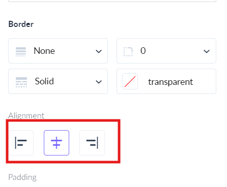
How to optimize block-level and column-level alignment for mobile devices?
1. Switch to mobile view using the dropdown at the top.

2. Select the block whose alignment you want to change. Change the alignment of the block from the left panel.
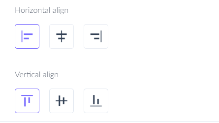
Note that all the elements in the block will inherit block-level alignment.
3. Similarly, select the column and change its alignment from the right panel. All elements inside the column will inherit the column-level alignment.
The configured block/column level alignment will only be applied to mobile devices and the desktop version will not be affected.
Optimizing block-level padding and column-level padding for mobile devices
When to optimize block-level padding and column-level padding for mobile devices?
While desktop devices have more space to work with, you can have higher padding to ensure readability and maintain enough white space. However, the extra padding and whitespace will increase vertical scroll and hinder legibility on mobile devices.
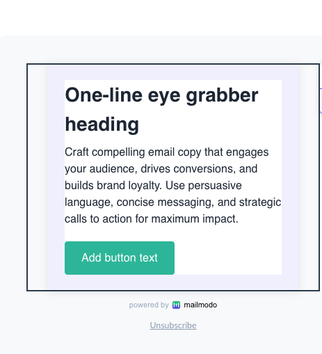
For example, this block has 24px padding on all sides on desktop.
This is how the template looks on mobile-
Now, we were to reduce the padding from 24px to 4px, this is how the template will look on mobile.
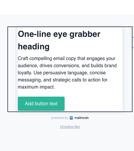
As you can see, we are able to accommodate more words in the same amount of space. As you add more content to your email template, this will have a compounding effect reducing the vertical scroll on mobile devices significantly.
Let us look at another example where changing the column level padding on mobile devices helps us accommodate more text in a 2 column layout. The right column has 20px padding on all sides.
This is how the template looks on mobile-
Now, if we were to reduce the right column padding to 4px, then this is how the template will look-
We are able to accommodate more text per line thus reducing the vertical scroll.
How to optimize block-level padding and column-level padding for mobile devices?
1. Select the block and set desktop padding from the left panel.
2. Toggle to the mobile version using the dropdown at the top.
3. Select the individual block and change its mobile padding from the left panel.
Note that the block/column level padding would only be applied to mobile devices and the desktop version will stay as it is.
Show or hide block on mobile devices
You can show or hide a block in a template based on the device on which the email is being opened i.e. desktop or mobile.
Why should you show or hide a block on certain devices only?
Some content blocks might be relevant for certain devices only.
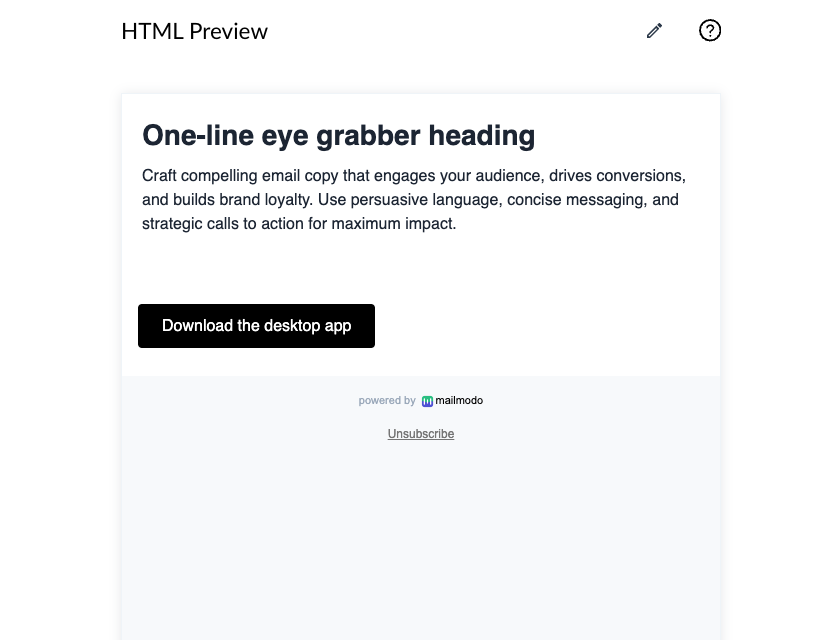
For example, I have 2 buttons in my template. One redirects to the desktop app download link and the second one redirects to the mobile app download link. The first button should only be visible to recipients opening the email on desktop while the second button should only be visible to recipients opening the email on mobile devices.
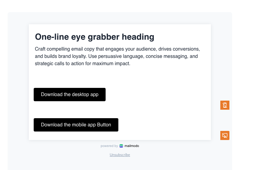
This is how the template will look on mobile-
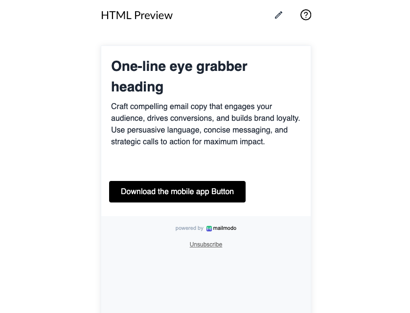
While this is how it will look on desktop-
Note that the feature is applicable to blocks and forms only. It is not available for widgets.
How to show or hide a block based on the recipient’s device type?
By default, a block will be shown on all devices. Follow the steps below to hide the block on mobile or desktop.
Hide on desktop
1. Select the block you want to hide in desktop view and scroll down the left panel. Under Hide Block choose Hide on desktop option. The block will be hidden on desktop devices.
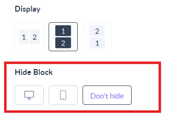
Hide on mobile
1. Select the block you want to hide in mobile view and scroll down the right panel. Under Hide Block choose Hide on mobile option. The block will be hidden on mobile devices.
Note: In the case of forms, you need to configure the AMP and HTML version separately.
Different font sizes for desktop and mobile
Mailmodo enables you to select and customize font sizes for desktop and mobile with our typography feature in the brand kit.
Why should you use different font sizes for desktop and mobile?
Mobile screens are small, so big fonts make reading emails easier. Using the same font on both phones and computers squishes everything, making it annoying to zoom in and out. Different fonts for different screens keep emails clear and enjoyable for everyone!
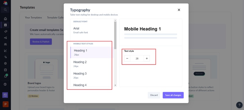
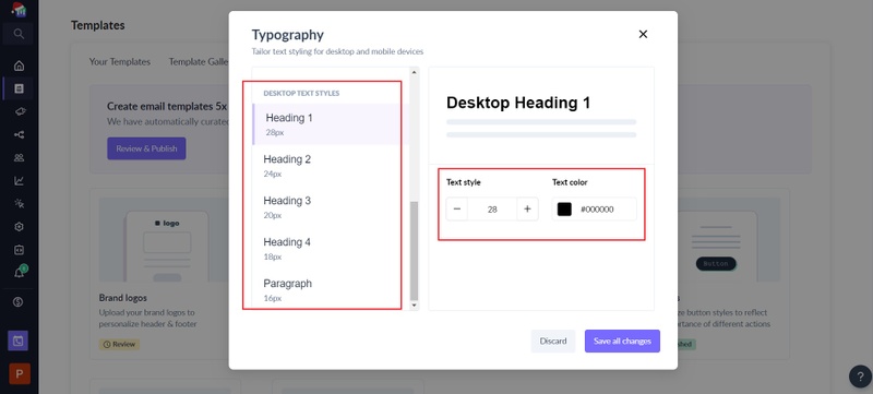
You can find the feature under Templates -> Brand Kit -> Typography.
Select the mobile and desktop font sizes for H1, H2, H3, H4 and P tag respectively. You can have different font sizes for desktop and mobile corresponding to each tag. For example, P tag can be 16px on mobile devices and 14px on desktop devices.
Learn more about brand kit typography .
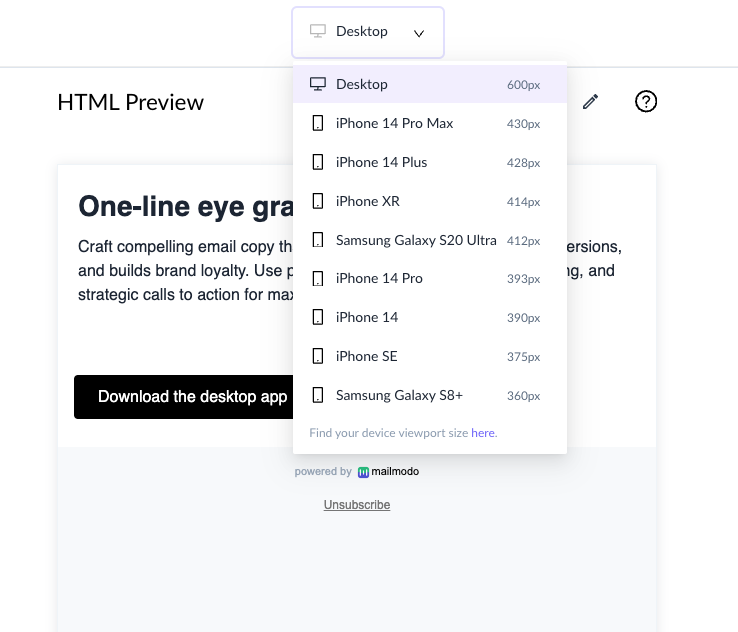
Preview template across different mobile devices
Mailmodo enables you to view how your template will look across different mobile devices.
Why should you preview your template across mobile devices?
By testing how your email appears on various mobile screens, you can improve user experience, increase engagement, and avoid potential issues with formatting or usability. It helps you create visually appealing and effective campaigns that resonate with mobile users.
How to preview your template across mobile devices?
1. Click on preview in the top right corner of your screen.
2. Select different viewports to see how the template will look across mobile devices.
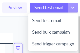
Send a test email
Once you have configured everything, it is imperative to send a test email to see how the email is actually rendering on desktop and mobile.

You've successfully learned how to customize your email template for mobile devices using our no-code email editor. Your emails are now ready to provide an optimal experience for users across various mobile devices and screen sizes. If you encounter any issues or have questions, don't hesitate to reach out to our support team for assistance.