

Promotional Campaign Dashboard
Last updated November 4, 2025
The overall dashboard is a report that gives you a clear idea of how your campaigns are progressing. It measures the performance of your campaigns by tracking all the relevant metrics like click rate, open rate, submissions, etc.
With these metrics, you can make an educated decision on what your users like and what they don’t.
✨ Powered by Mailmodo AI — Try it out today Mailmodo AI helps you instantly interpret your campaign data, detect engagement trends, and uncover actionable insights across all your dashboards — saving you hours of manual analysis.
Overview of the Overall Dashboard
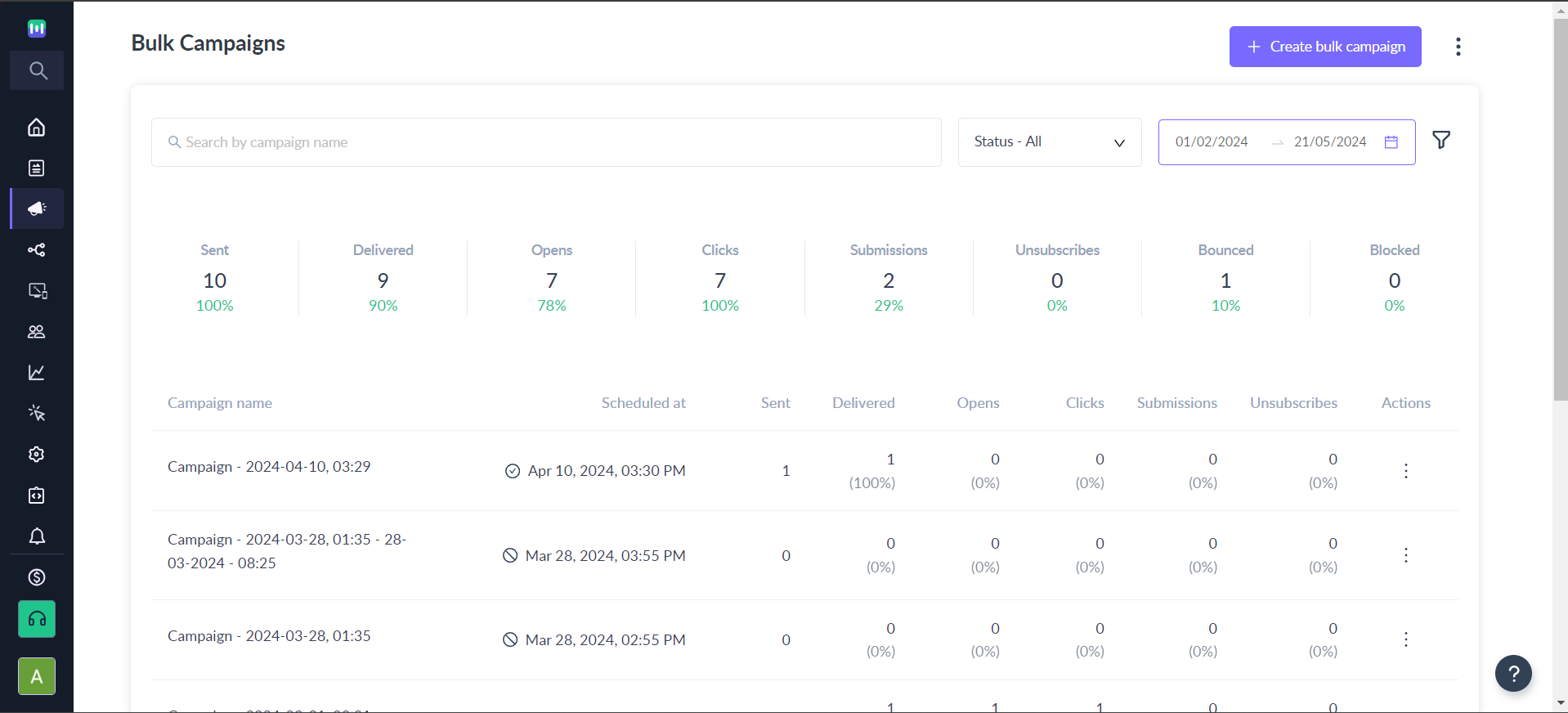
There’s a Quick Summary that gives you a cumulative report of all campaigns sent. This tells you of your company’s total outreach with all your campaigns combined.
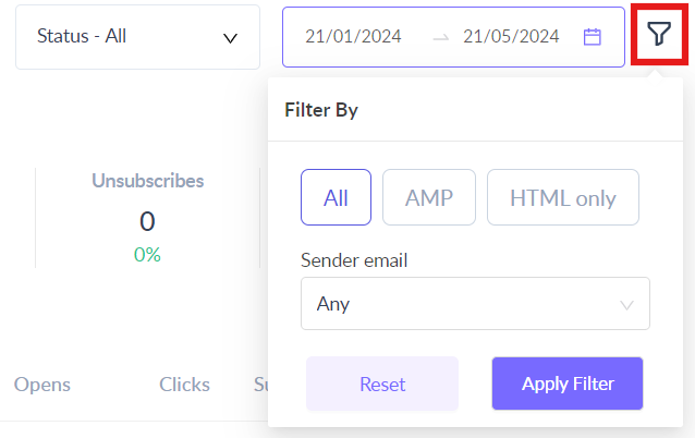
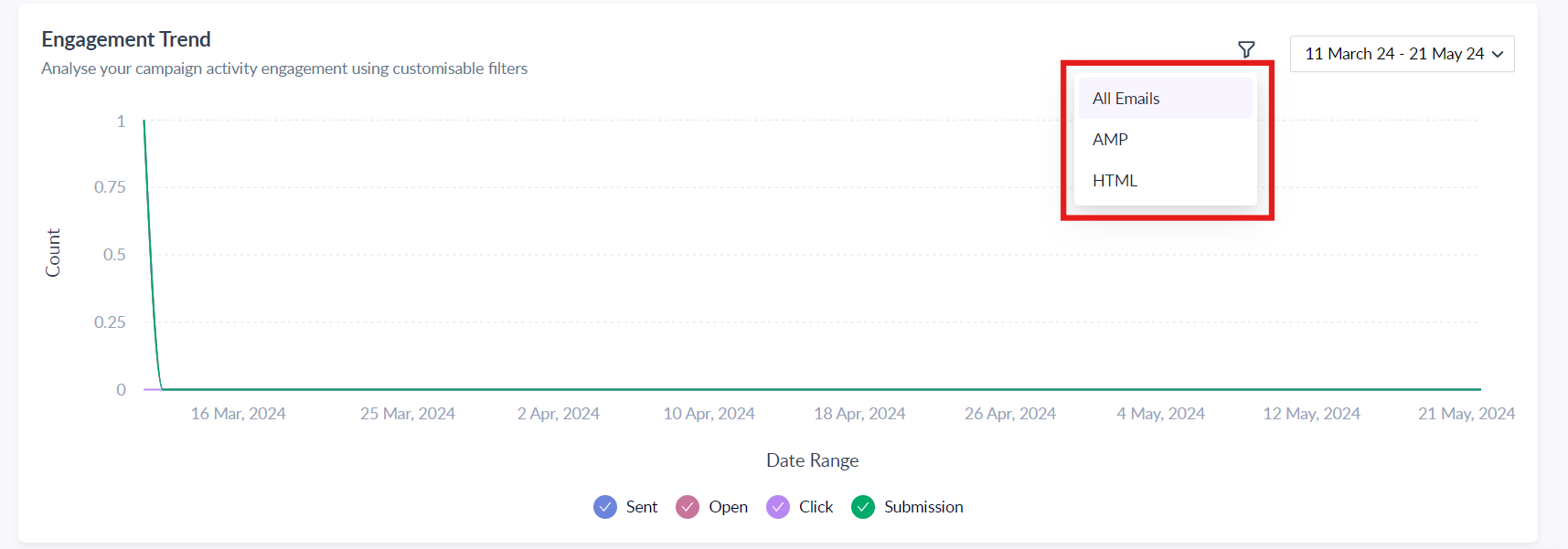
Filters
The Filters button is used to get a more specific report as per your requirements. The below image shows what types of filters you can set.
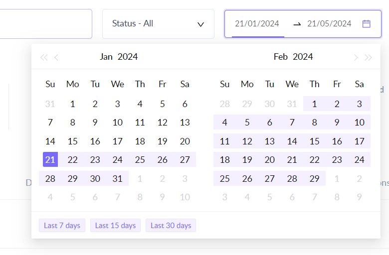
Date-wise filter
With the Date-wise filter, you can see the overall performance of your campaigns over a particular period of time. Just enter the dates in the given calendar as shown below.
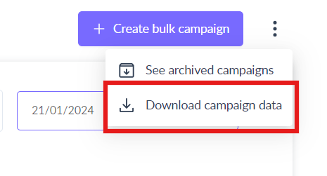
Download campaign data (Overall Dashboard)
The Export Data action on the overall dashboard lets you import data of all your campaigns in one CSV file.
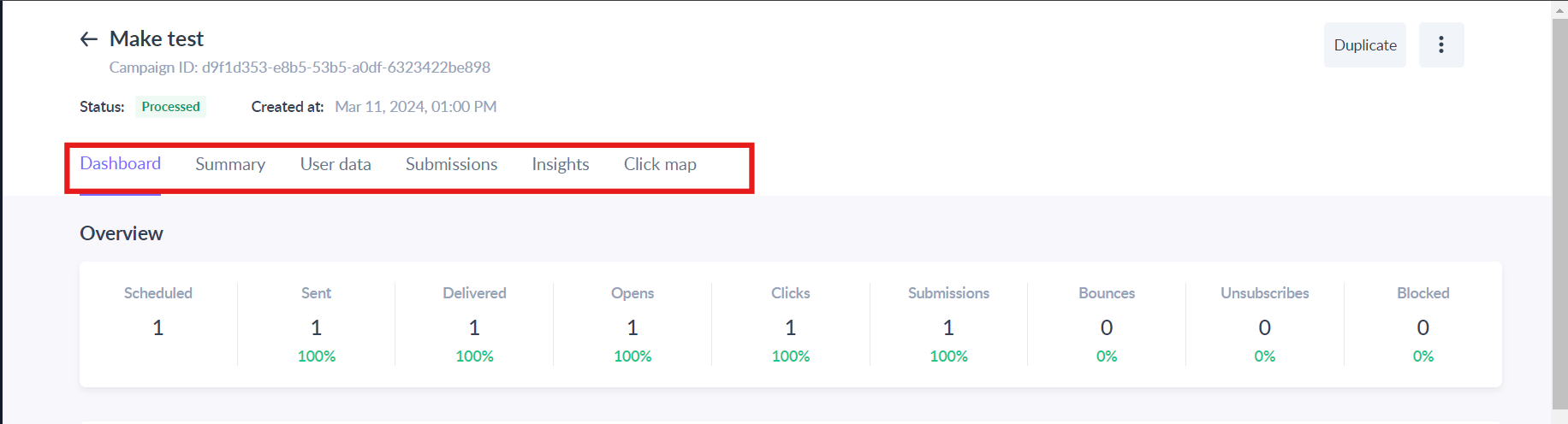
Overview of the Individual Dashboard
There are multiple sections of the report that give you an in-depth summary of your campaign. There are six sections - Dashboard, Summary, User Data, Submissions, Insights and Click map.
It looks like this:
Now let’s see what actions you can perform on the individual dashboard.
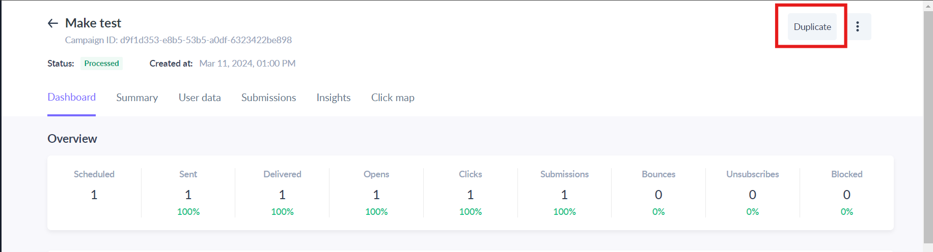
Actions on the Individual Dashboard
Here are the actions you can take on the individual campaign dashboard:
Duplicate
The Duplicate button is used to make a copy of any previous campaign. When you click on Duplicate, the details of the campaign that was opened get copied and pasted into the start of a new campaign.
You don’t have to fill in the subject line, preheader text, from name, etc.
Archive
This button is used to remove a campaign from your dashboard. You can no longer see it on the dashboard.
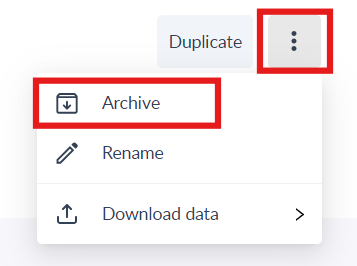
But the campaign doesn’t completely disappear. It is saved in Mailmodo's database. To retrieve it, you’d have to put a request with the support team.
Download data (Individual Dashboard)
This button is used to export different kinds of data from a campaign.
You can export 4 types of data - Campaigns Data, Clicks Data, Opens Data, Form Submissions and Bounce Data. Just click on Download Data to choose the aforementioned options.
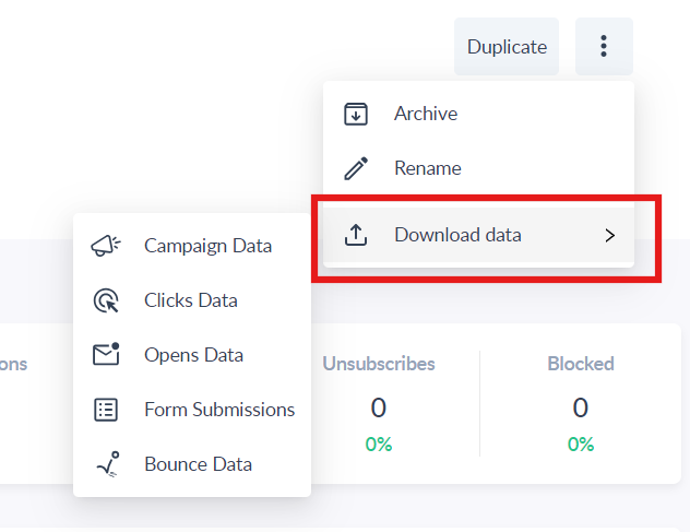
When you click on either of the five, the data gets exported to a CSV file which can be accessed in Download Centre.
Campaign Data
This tells you the overall details related to a campaign like HTML opens, amp opens, HTML clicks, amp clicks, etc. When you click on Campaigns Data, a CSV file gets downloaded which contains all the information you need.
You can get the data for both bulk campaigns and trigger campaigns.
Clicks Data
Clicks Data or Click-through rate data is the proportion of people or subscribers who click on a particular link out of the total users who view the email.
CTR (click-through rate) is often considered a reliable metric while measuring the performance of a campaign. But campaigns with multiple links or CTAs, knowing what’s getting the most clicks can help you create better campaigns in the future.
You can obtain the clicks data for normal bulk campaigns as well as trigger campaigns.
Refer to Link Wise Click Tracking to learn how to export the clicks data.
Dashboard
The individual campaign dashboard is a visual report that gives you a clear idea of how your individual campaigns are progressing. It measures metrics like clicks, opens, submissions, etc., to better understand what your users like and helps you send campaigns according to their preferences.
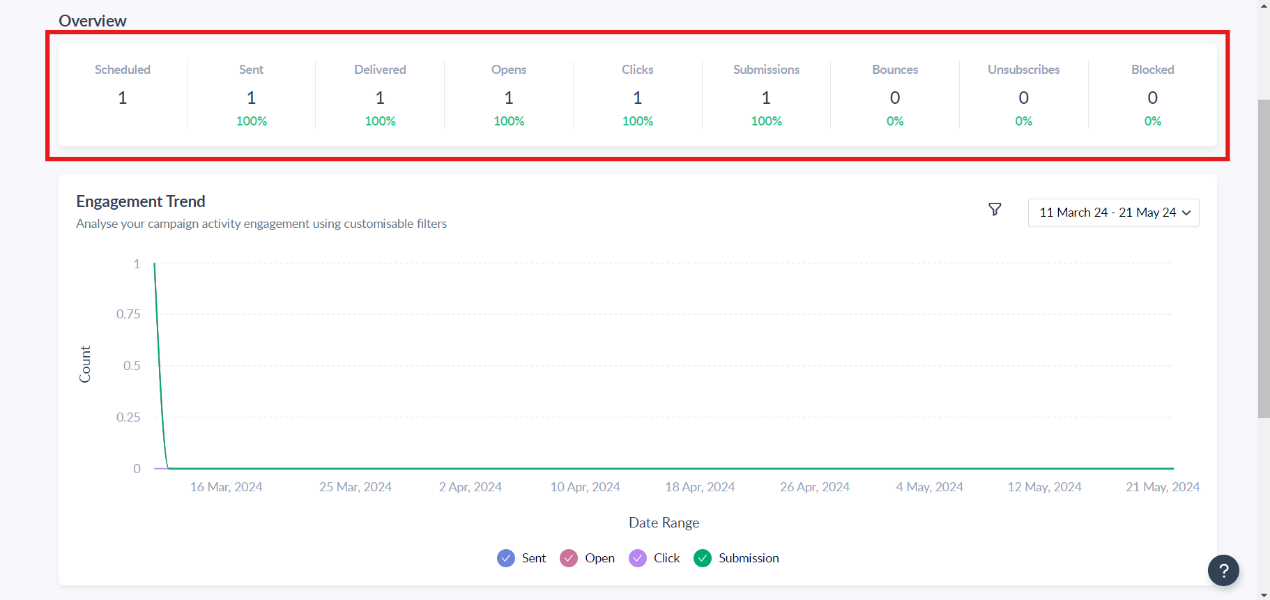
The following parameters are tracked for every email campaign sent via Mailmodo:
- Sent: It's the number of emails sent in the campaign.
- Sent %: Emails Sent / Emails Scheduled.
- Delivered: It's the number of emails that were delivered to the recipients.
- Delivery % : Emails Delivered / Emails Sent.
- Open: the number of unique recipients who have opened the campaign.
- Open Rate: Emails Opened / Emails Delivered.
- Clicks: It's the number of subscribers who ‘click’ on at least one link in the email.
- Click to Open Rate: Clicks / Opens.
- Submission: It's the number of subscribers who submitted the form in the email.
- Submission Rate: Submissions / Opens.
- Bounce: It's the number of hard and soft bounces from the subscriber list.
- Bounce Rate: Bounces / Emails Sent.
- Unsubscribe: It's the number of contacts who have unsubscribed (from your list).
- Unsubscribe Rate: Unsubscribes / Emails Delivered.
- Blocked: It's the number of contacts that were not sent this campaign because they unsubscribed or got bounced in the past.
- Blocked %: Emails Blocked / Emails Scheduled.
Graphs/Visual Representation
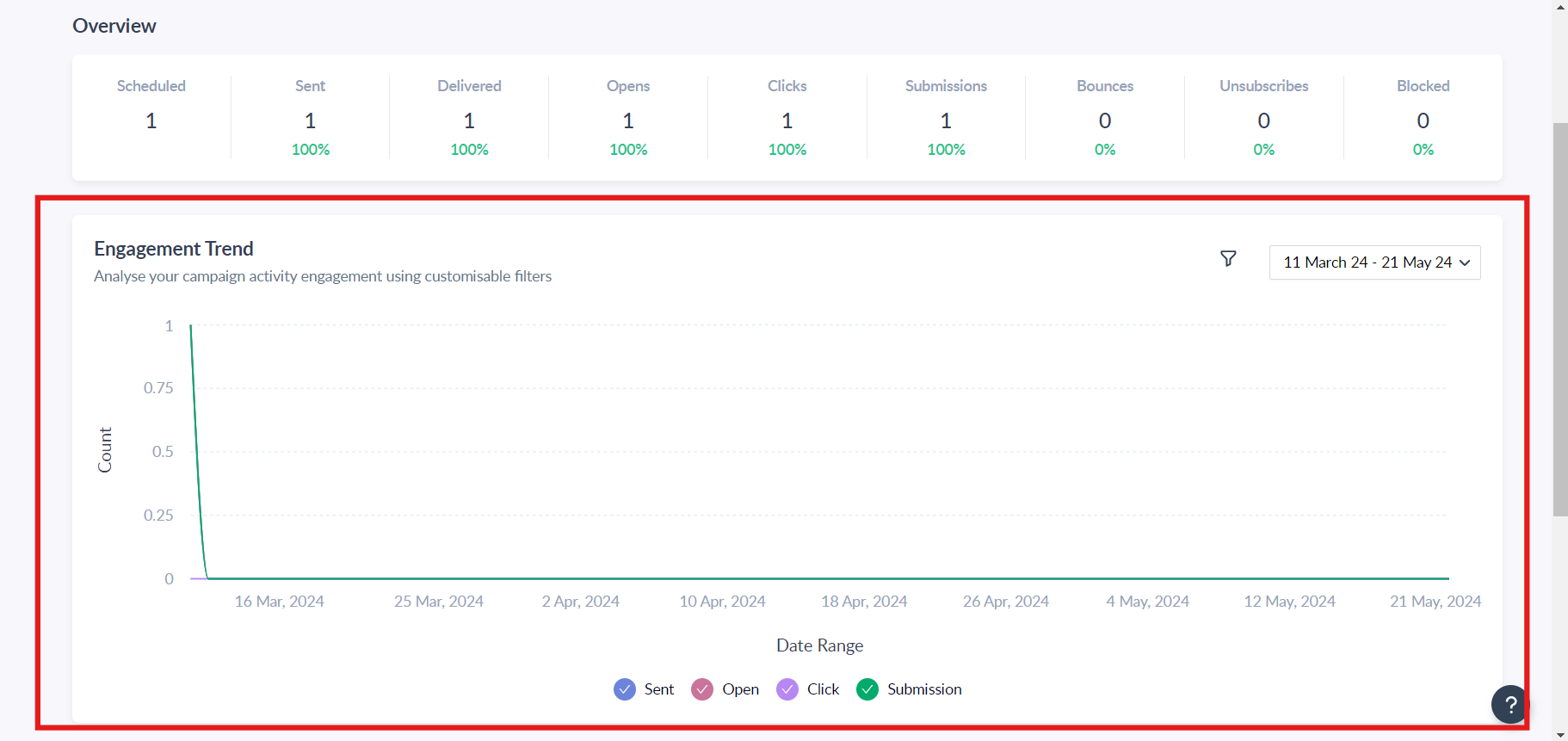
It shows a graphical representation of the campaign’s performance which is color-coded to better differentiate between the metrics on the graph.
You can view the graph for AMP as well as HTML in case you want to see how they performed in comparison to each other.
Batch wise Analysis (for campaigns using Fragmented scheduling)
This report assists in tracking key metrics for a bulk campaign scheduled in multiple batches, a strategy often used to warm up your domain.
You can also view the batch schedule in this report by clicking on "See Batch Schedule." This feature provides a detailed view of the configured batches and their respective sending times to contacts.
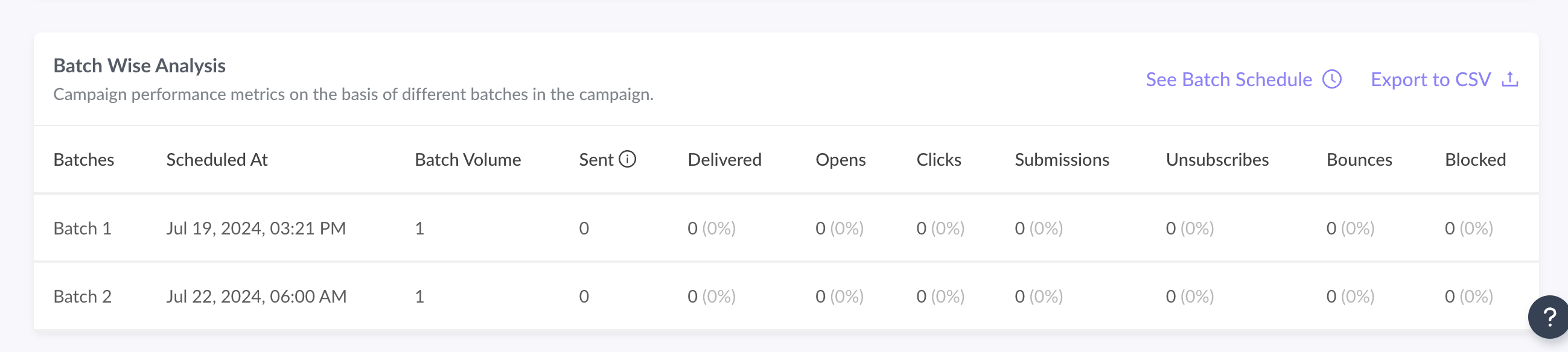
Your campaign in subsequent batches is sent out to your contacts and you can track the sent, open, bounce, blocked etc.
Note: The sent count can be less than batch volume in cases where there are blocked emails, invalid emails or duplicates in any of the batches. You should download the CSV report to see complete details.
Summary
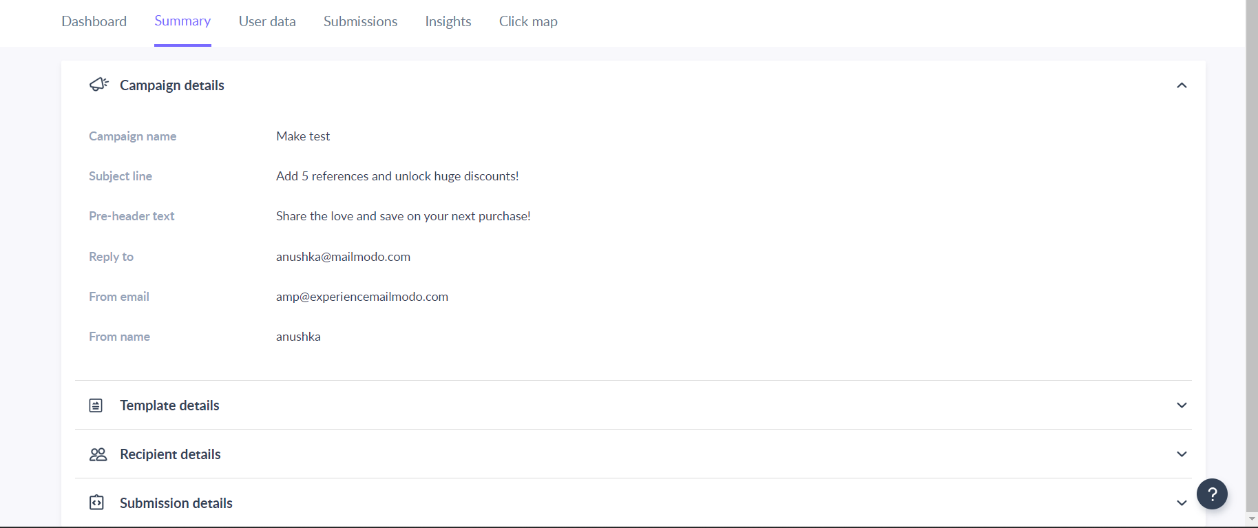
This tab shows you the recipient details, campaign details, and how your email would have looked to the recipients.
Under Recipient Details, you have your list name, its audience size, and its creation date.
Under Campaign Details, you have the campaign’s name, the name of the template you’ve used, pre-header text, subject line(s), reply-to email, from email, and from name.
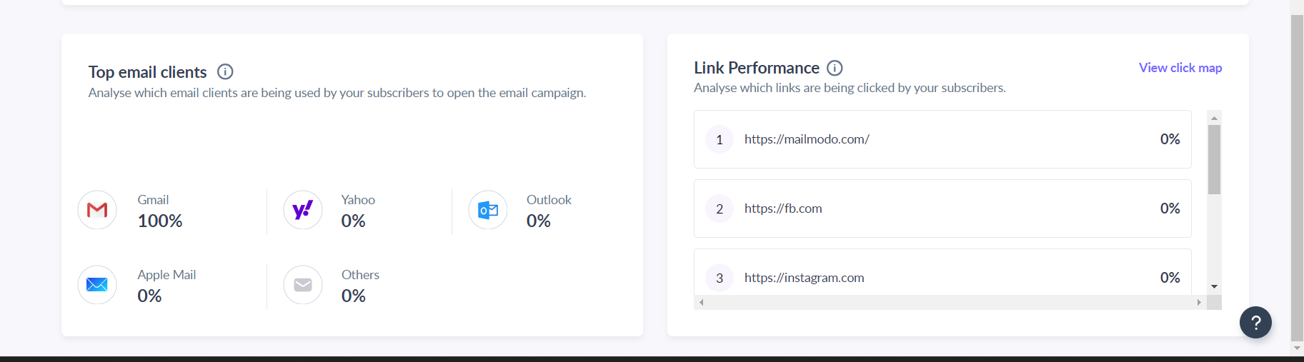
User Data
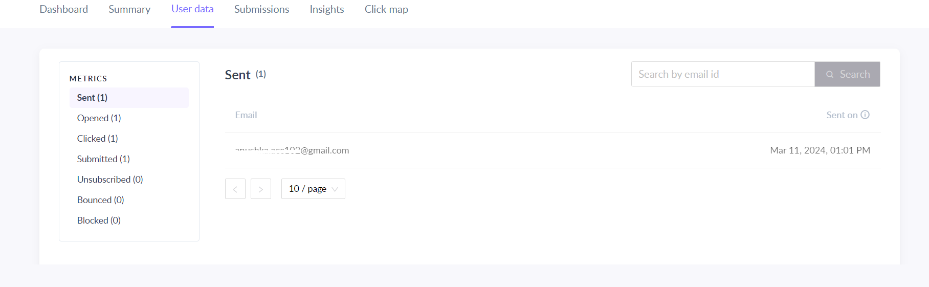
It shows you the relevant data for every contact you have sent the campaign to. It shows stats like Open Html, Open Amp, Click Html, Click Amp, etc.
Open Html means how many times the email’s HTML version was opened. Open Amp means how many times the email’s AMP version was opened.
The same goes for Click Html and Click Amp. It shows the number of AMP/HTML elements the recipients have clicked in the email.
Submissions
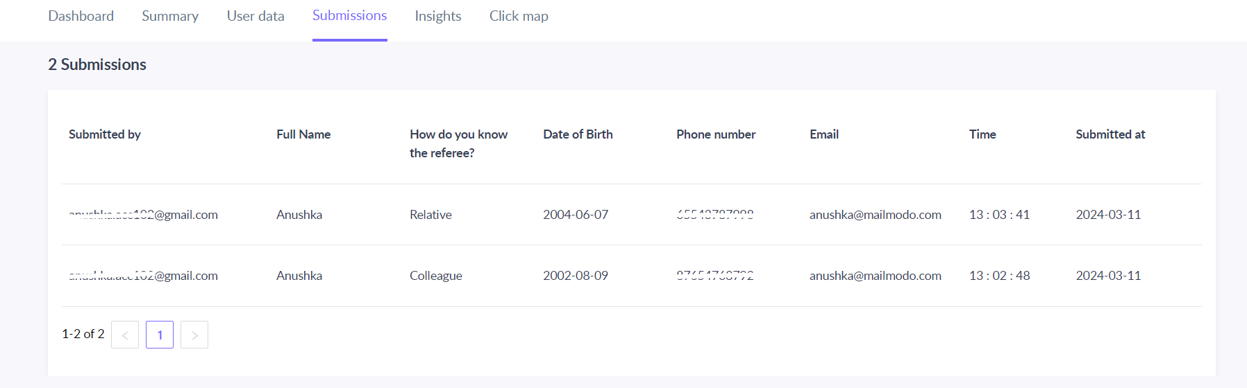
The responses of the forms, quizzes, polls, etc., designed in the email template get stored in the submission tab of the analytics dashboard for every campaign.
Insights
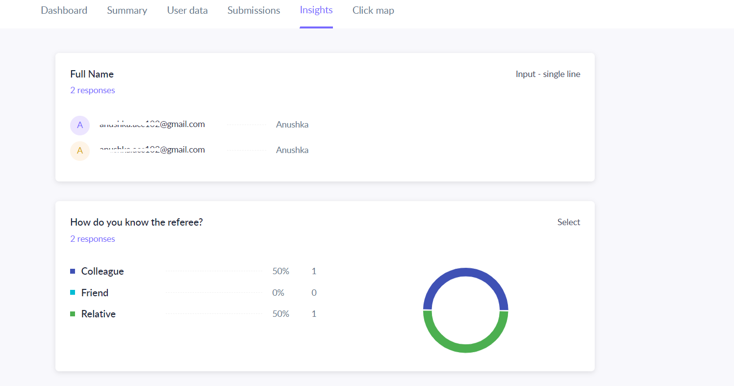
It shows you a generic view of the responses submitted by the recipients. The numbers here are shown in percentages. It means it tells you what percentage of recipients chose a particular answer (in the case of a quiz).
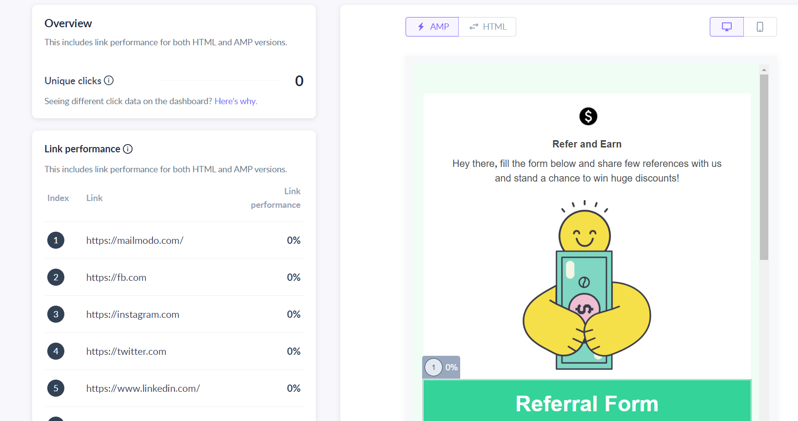
Click Map
Use the search bar in our Help Center to find quick guides and walkthroughs. If you have any queries, then reach out to us via the chat icon on the bottom right corner of your screen while using Mailmodo. Or reach out to us at Mailmodo Support and share your thoughts at Mailmodo Product Feedback.