

How does image scaling work on mobile devices?
Last updated June 12, 2025
Understanding Scaled Down and Full Width Images on Mobile Devices
Mobile is one of the most popular email reading environment. It is essential to optimise your email for mobile devices to ensure the best user experience. Learn how to customize your email template for mobile devices using the no-code email editor .
In this article we are going to understand the difference between scaled down and full width images on mobile devices. The way images are displayed plays a crucial role in capturing attention and conveying information effectively.
When you add an image to your email template, you would be able to define how the image will look on mobile devices. You have two options, scaled down and full width.
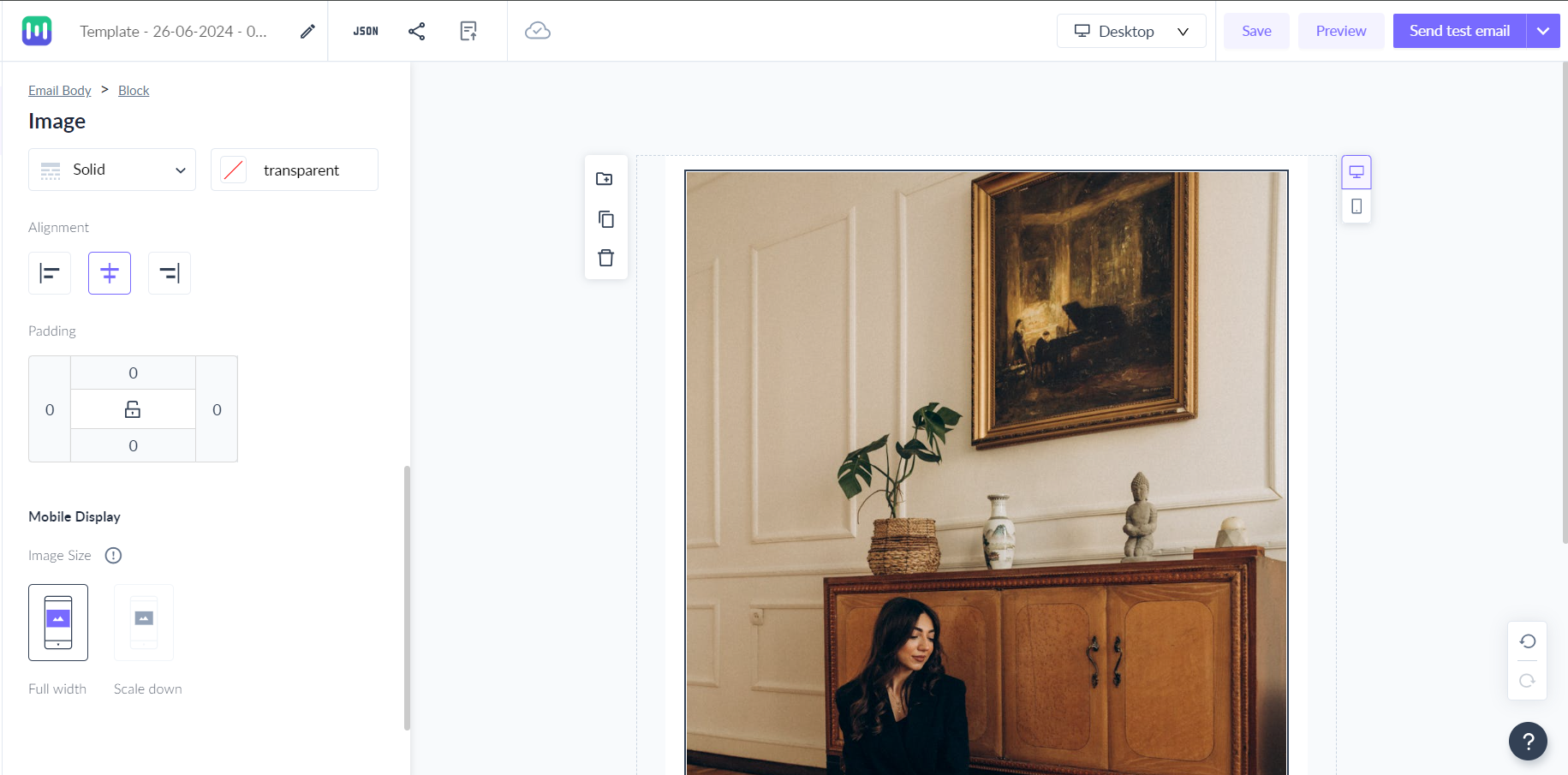
Scaled Down Image:
- When selecting a scaled-down option for an image on a mobile device, the width of the image will be set to the computed width based on the size you choose in either percentage (%) or pixels (px).
- If the computed width is less than the available width on the mobile device, the image width will be equal to the computed width.
- If the computed width is more than the available width on mobile device, the image will be scaled down to the maximum available width.
Let us understand this with an example-
Case 1: Computed width is less than the available width on mobile
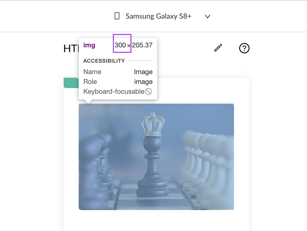
If the image width is set to 50%, then image width in pixels would be 50% of 600px (email body width) which is equal to 300px. So, computed width=300px.

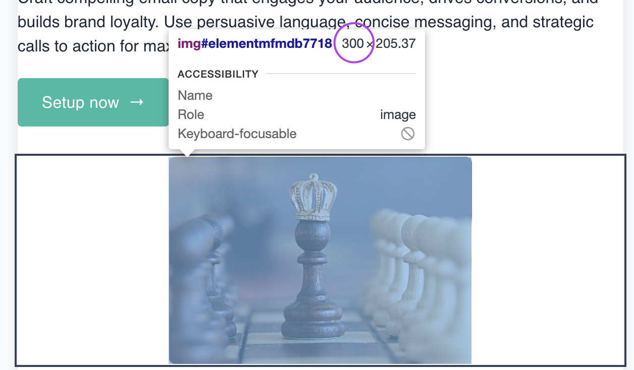
Now, if the email is opened on a device with a 360px viewport, and you have chosen scaled down option, then the image width will be equal to the computed width i.e 300px.
Case 2: Computed width is more than the available width on mobile
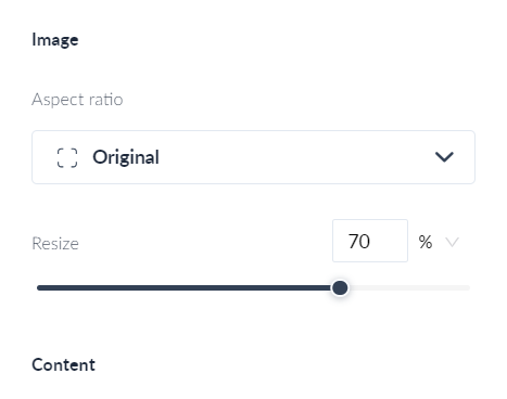
If the image width was set to 70% , then computed width would have been 70% of 600px i.e 420px.
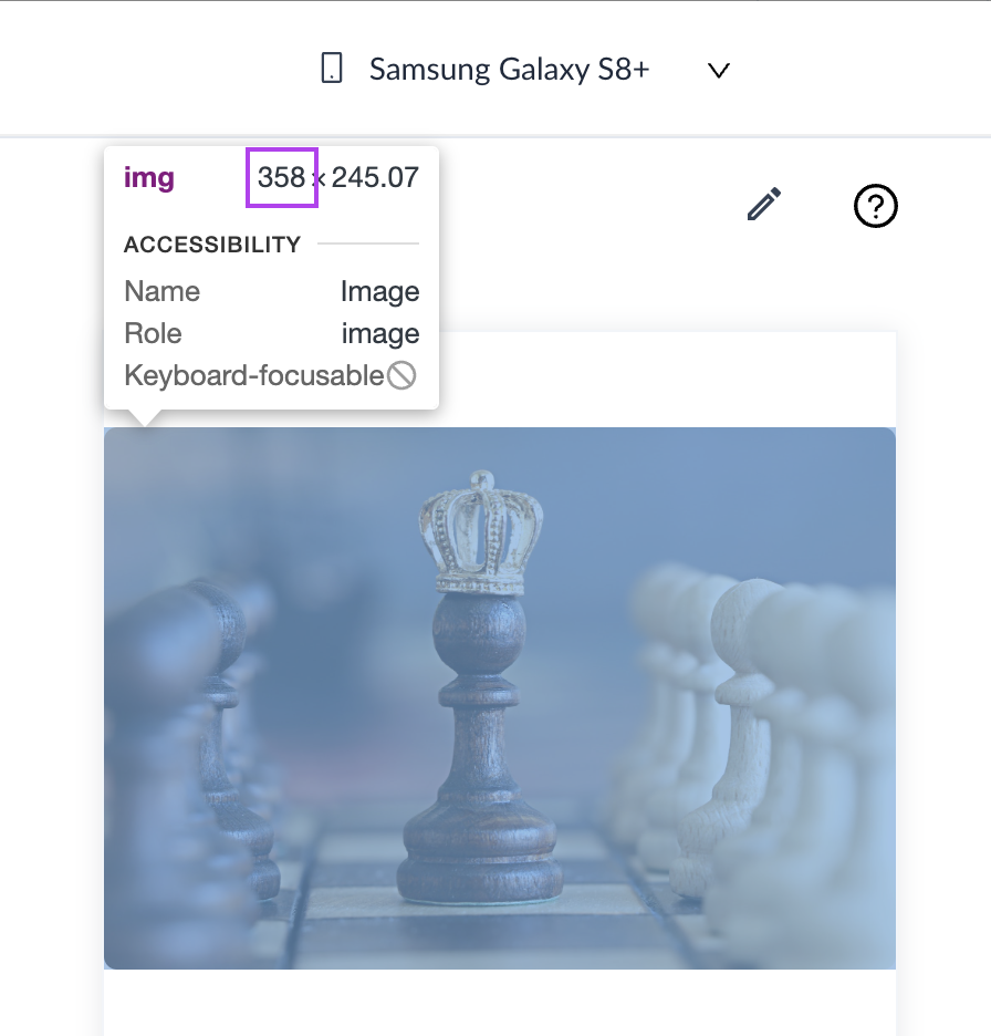
Now, if the email is opened on a device with a 360px viewport, and you have chosen scaled down option, then the image width will be scaled down to the maximum available width i.e 360px.
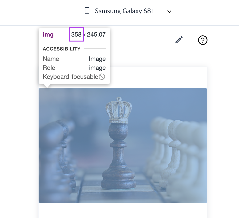
In the above screenshot, 2px padding is present because of which the image width is 358px instead of 360px.
In this example, the block was a single column layout with no padding so image width was 50% of the available width. If it was a multi column layout where each column takes 50% width, then the email width would have been computed as a percentage of the column width for eg. 50% of (50% of 600px) = 150px.
Full Width Image:
- Opting for a full-width image setting on a mobile device means that regardless of the computed width, the image will be displayed at full width i.e 100% of the available width on mobile device.
- Even if the computed width is less than the available space on the mobile screen, selecting full width will scale the image to occupy the entire width of the screen.
Again, let us understand this with an example-
Case 1: Computed width is less than the available width on mobile
If the image width is set to 50%, then image width in pixels would be 50% of 600px (email body width) which is equal to 300px. So, computed width=300px.


Now, if the email is opened on a device with a 360px viewport, and you have chosen full width option, then the image will be scaled up to occupy 100% of the available width i.e 360px.
Case 2: Computed width is more than the available width on mobile
If the image width was set to 70% , then computed width would have been 70% of 600px i.e 420px.

Now, if the email is opened on a device with a 360px viewport, and you have chosen full width option, then the image width will be scaled down to the maximum available width i.e 360px.

So, in both the cases, image width will be equal to 100% of the available width on mobile device (after adjusting padding).
If the computed width of an image exceeds the available width on a mobile device (e.g. 500px on a narrower screen), both scaled down and full-width options will appear visually identical.
Ensure that you always preview the email across different viewports and send a test email to ensure the email is rendering properly across devices.