

Adjusting Landing Page Elements
This is the third article in a list of articles designed by Mailmodo to help you launch a landing page:
- Setting up landing pages in Mailmodo
- Defining landing page structure
- Adjusting landing page elements (here)
- Enhancing landing page functionality: Forms & Tracking
- Launching your landing page
It will be good to read the first two article in the above series to get an understanding of the basics of landing pages in Mailmodo.
Common settings
Commonalities exist in settings applicable to both sections and elements. Our initial focus will be on articulating these shared configurations, followed by an in-depth examination of settings unique to each entity.
Alignment
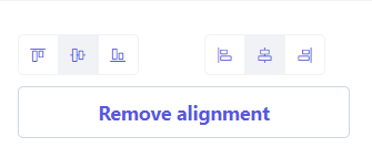
The Alignment setting provides you with the capability to dictate the precise alignment of an element, both horizontally and vertically, according to your specific preferences.
When you will select a section then alignment section will be visible on the right hand side panel.
Spacing
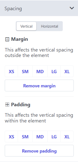
The Spacing setting empowers you to meticulously control the vertical and horizontal space surrounding and within sections and elements:
- Margin: Generates space around a component, beyond any defined borders.
- Padding: Establishes space within a component, differentiating the section or element from its borders.
When you will select a section then spacing section will be visible on the right hand side panel.
Choose from a range of spacing sizes, ranging from XS (smaller) to XL (larger), allowing for tailored precision in your design.
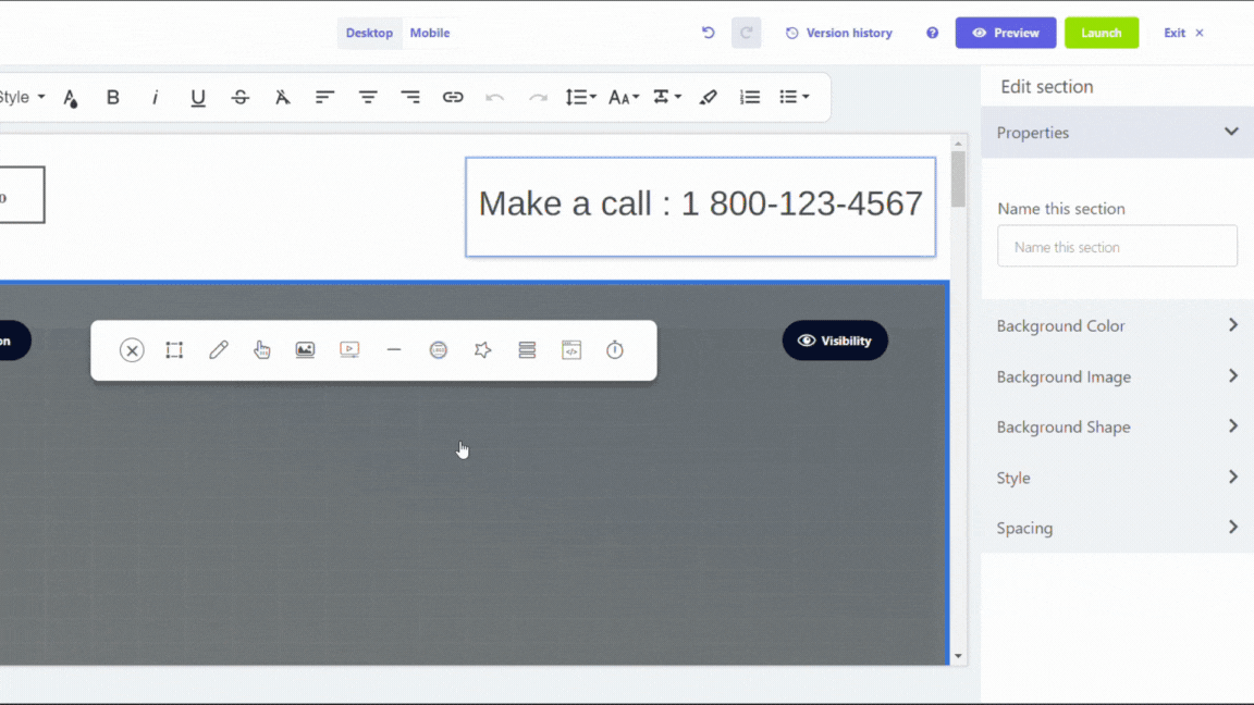
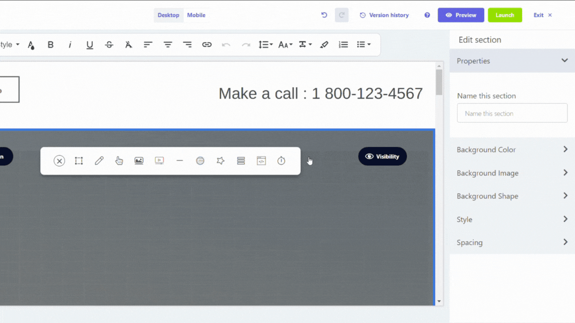
Visibility
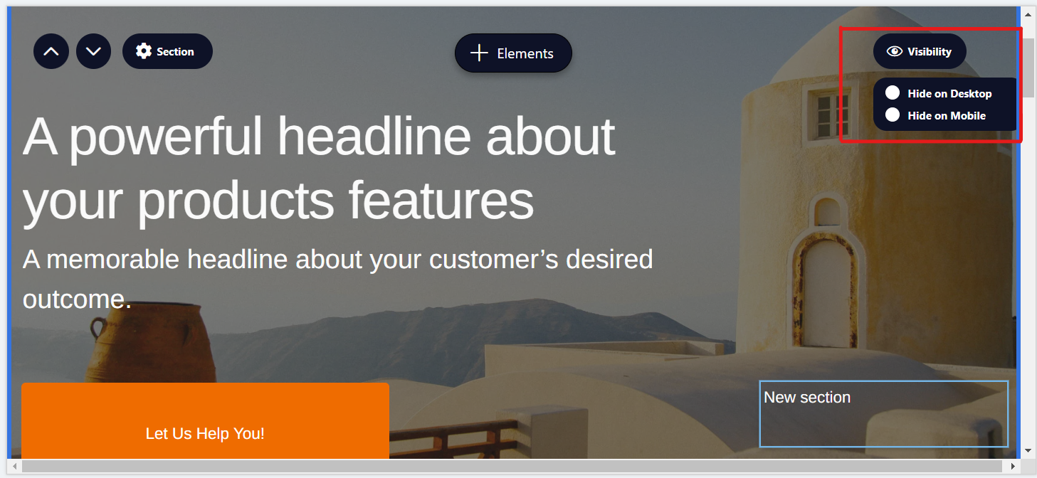
In sections, Visibility setting puts you in command of the visibility dynamics on your landing page, contingent on the device in use. Opt to either conceal on Mobile and/or Desktop. When opting to obscure a section on a specific device, witness the section crossed in the editor, accompanied by the explicit message: "This section is not visible on mobile/desktop," aligning with your chosen preference.
Click on the section-> Click on Visibility on upper right hand side->Choose between 'Hide on Desktop' and 'Hide on Mobile'.
You can hide a section from only one device at a time. Trying to hide section from both devices will give error.
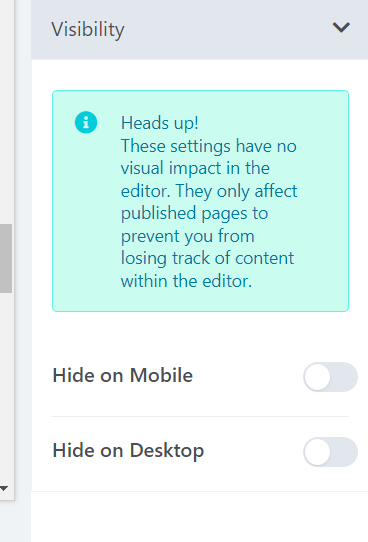
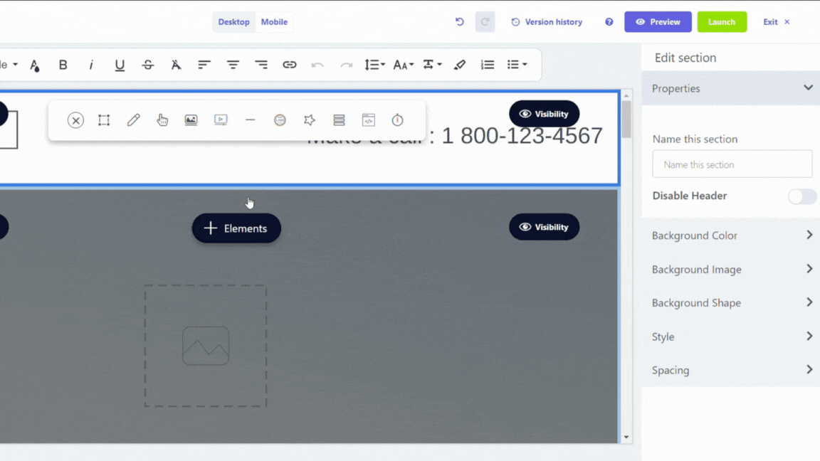
For elements too we have the option to hide them in mobile or desktop. Even if we hide an element, it will be visible in the editor. The effect will come into place after publishing.
Select element->Click on Visibility on the right panel
Background colour
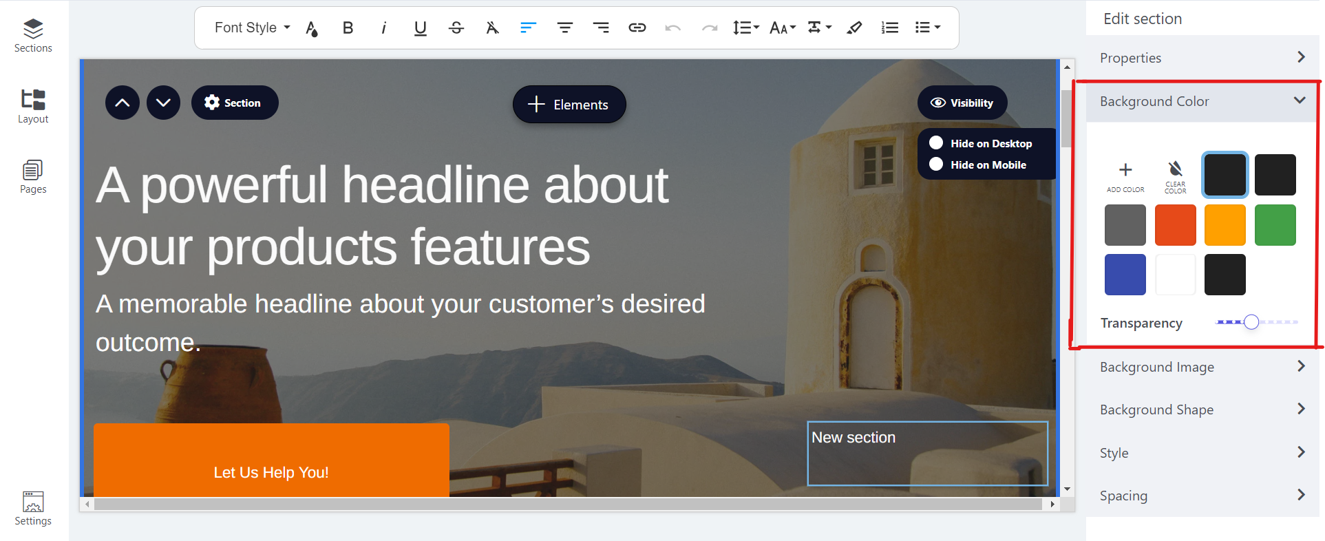
The Background Color setting offers the capability to infuse a section or element with a chosen background color while providing the means to finely regulate its transparency.
It will be visible on the right hand panel after you will select a section or element.
Background image
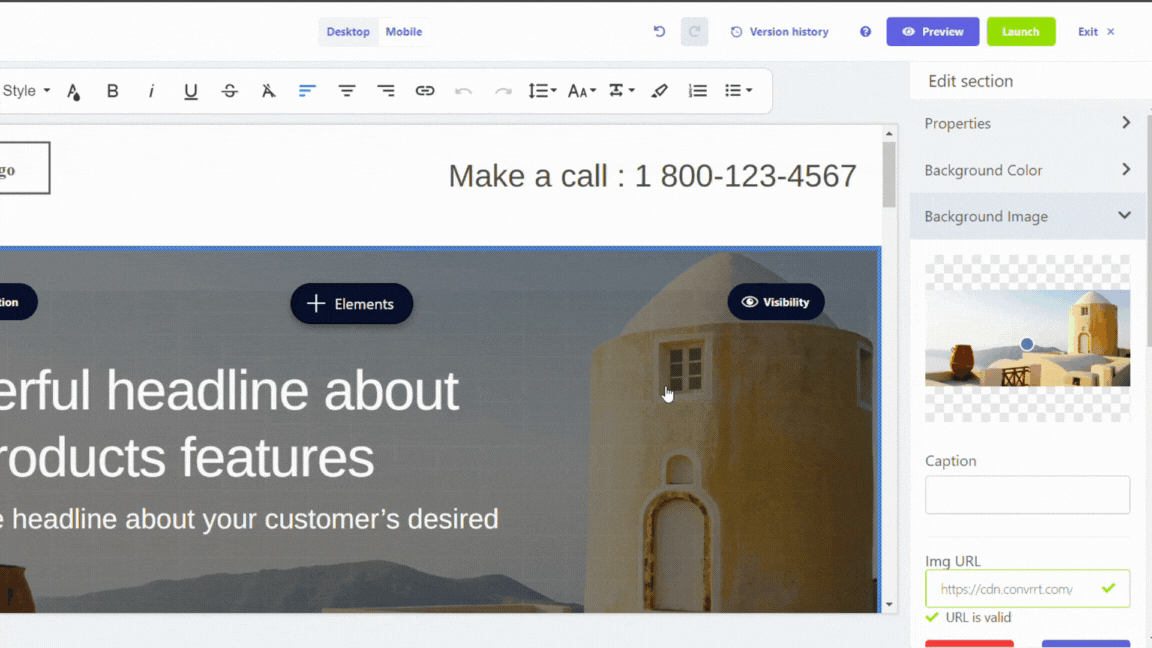
The Background Image setting is a potent tool, facilitating the incorporation of images sourced from our library, a specific URL, or your local repository as the backdrop for a section or element:
- Caption: Enhance your design with a descriptive caption for the background image.
- Remove: Effortlessly eliminate the existing background image.
- Replace: Seamlessly opt for a new background image to supplant the current selection.
- Background Size: Tailor the presentation by specifying how the background image should fit within the dimensions of the section or element.
- Background Repeat: Exercise control over the repetition of the background image across the expanse of the section or element.
- Color Overlay: Elevate aesthetics by introducing a color overlay above the content, with the added ability to regulate its transparency.
It will be visible on the right hand panel after you will select a section or element.
Background shape
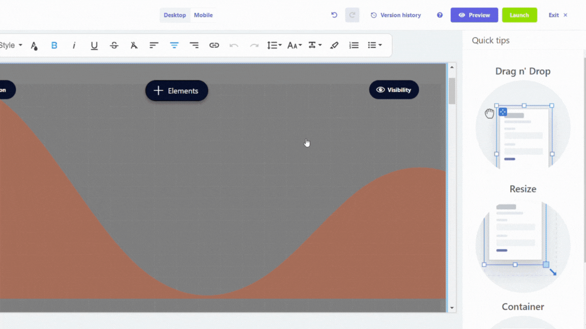
You can use Background Shapes to make your landing page look better visually. You can select a Shape from the dropdown menu, add Color, set Transparency, Width and Height as well as Invert it. The option is visible on the right hand panel, after selecting a section or element.
Section
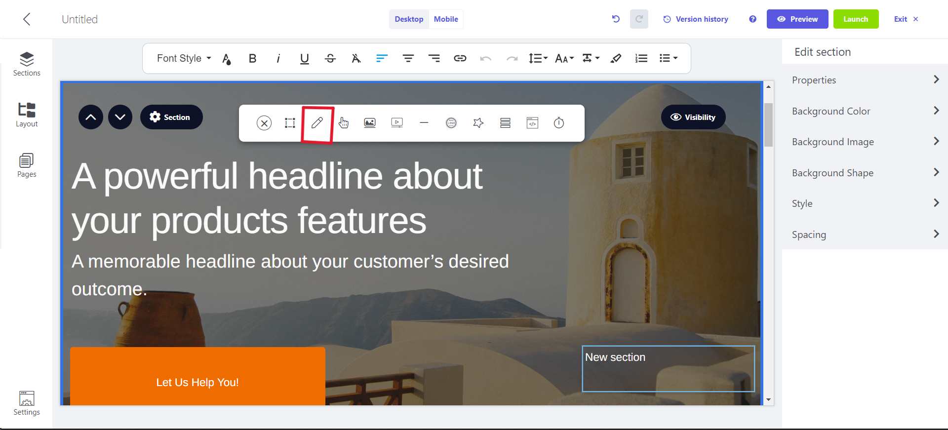
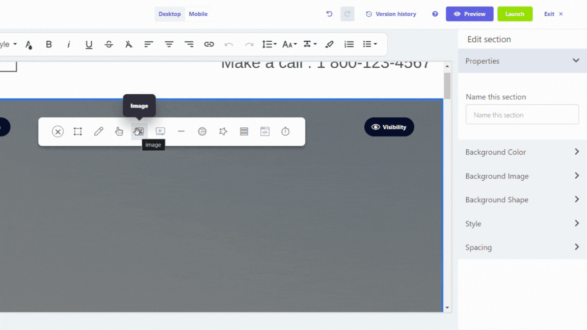
Properties
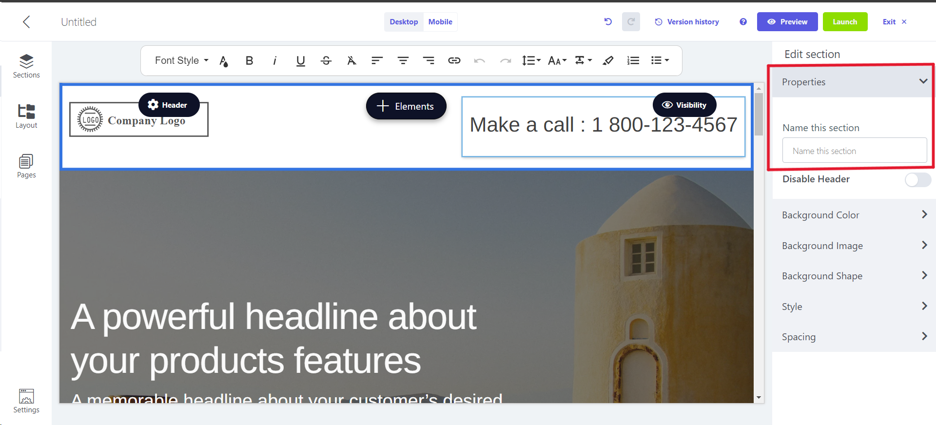
The Properties setting enables you to change the name of the section. The section name is visible in the right panel as you navigate through it.
We suggest assigning names to your sections as it aids in convenient tracking and navigation through them.
Style
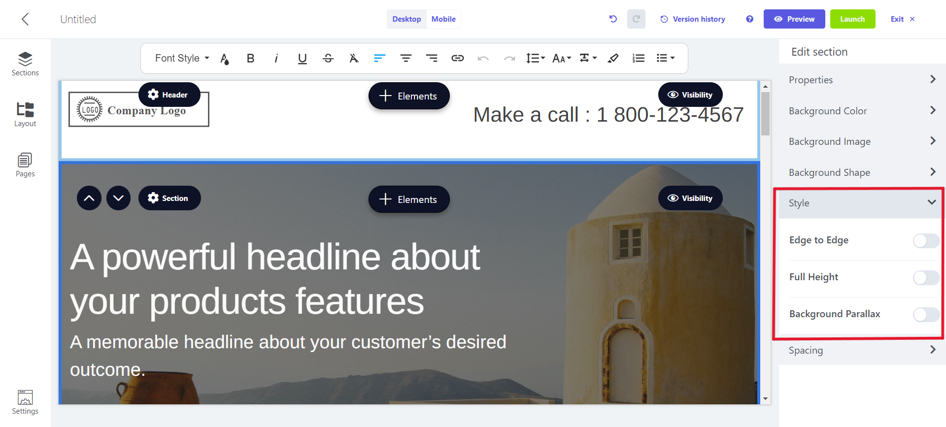
The Style setting provides options for personalizing the section's visual presentation:
1. Edge to Edge: Influences the horizontal spacing on the section's sides.
2. Full Height: Presents the image in its entirety, filling the entire section.
3. Background Parallax: Implements Parallax scrolling to create a slower scroll effect for the section's background image compared to the foreground content.
Background colour, background image and spacing
The Common settings section of this article details the Background Color, Background Image, Background Shape and Spacing configurations.
Text
Utilize a Text element to incorporate and format text on your landing page.
Formatting Bar
The formatting bar allows you to adjust the style of your text.
Select the text you wish to edit (revealing the formatting bar) -> Click the three dots on the right for additional customization options.
Alignment and Spacing
The Common settings section of this article details the Alignment and Spacing configurations.
Image
Incorporating images is an excellent method to personalize the design of your landing page, enhancing its appeal. Choose an image from our library, import one from a URL, or upload directly from your computer.
Alignment and Spacing
The Common settings section of this article details the Alignment and Spacing configurations.
Image
The Image settings enable you to pick an image and adjust its size:
- Preview: View the image you want to edit.
- Caption: Add text regarding the image.
- Image URL: Input the URL of the desired image.
- Remove: Erase the current image.
- Replace: Select a new image to substitute the existing one.
- Resize: Determine the desired dimensions of the image.
- Crop: Remove unwanted parts of image.
Style
The Style setting empowers you to specify the visual attributes of the image:
- Drop shadow: Apply a shadow effect to the image.
- Border radius: Determine the degree of rounding for the image.
- Border style and color: Introduce a border to the image with the option to choose its style and color.
- Border width: Set the thickness of the image border.
- Border radius: Adjust the roundness of the image border.
Logo
Incorporating logos is an ideal method to showcase your brand identity on your landing page.
Alignment and Spacing
The Common settings section of this article details the Alignment and Spacing configurations.
Image
The Image setting provides the ability to choose a logo and adjust its size:
- Caption: Attach a descriptive caption to the logo.
- Image URL: Input the URL of the logo.
- Remove: Eliminate the current logo.
- Replace: Opt for a new logo to substitute the existing one.
- Crop logo: Adjust the logo dimensions by cropping it.
- Alt: Include an alternative text tag to provide descriptive information about the logo.
- Link: Attach a redirect link to the logo.
Style
The Style setting empowers you to customize the visual attributes of the logo:
- Border style and color: Incorporate a border to the logo and choose its color.
- Border width: Specify the width of the logo's border.
- Border radius: Adjust the level of roundness for the logo's border.
Button
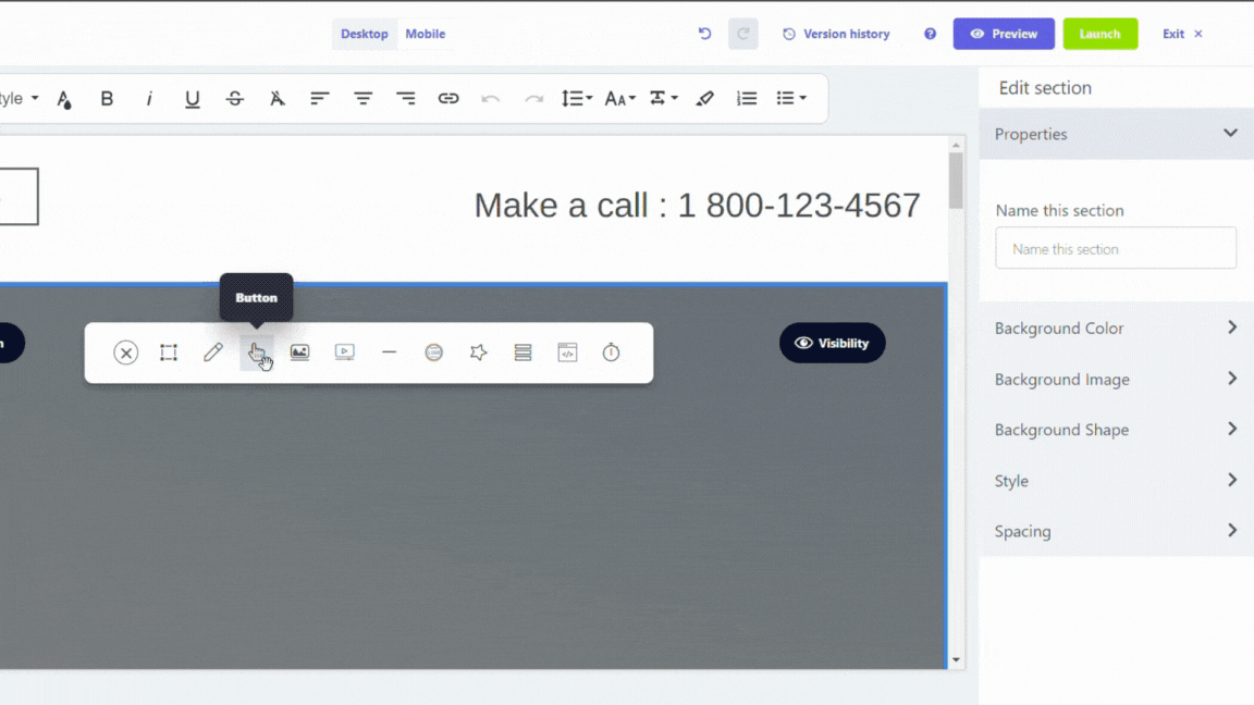
Employing a Button element allows you to create links to external websites or other sub-pages within your landing page. Incorporating buttons on your landing page is an effective way to emphasize and encourage interaction with specific links.
Alignment, Spacing, and Visibility
The Common settings section of this article details the Alignment, Visibility and Spacing configurations.
Properties
The Properties setting provides options for specifying the destination of the button:
- Call to action: Input the text to be displayed on the call-to-action button.
- Pick an action: Choose among three actions — link to a URL, anchor to a section, or link to a page within this funnel. - If anchoring to a section, select the relevant section from the drop-down list. - If linking to a page in this funnel, choose the desired page from the drop-down list.
- Pick a target: Opt to open the link in a new tab.
- URL (link): Specify the link where the button should redirect.
Style
The Style setting empowers you to tailor the visual presentation of the button:
- Color: Select the desired color for the button.
- Outline style and color: Opt for an outline type and color for the button.
- Outline width: Specify the width of the button's outline.
- Full width: Decide if the button should span the entire width of your page.
- Fill: Choose between a solid or hollow appearance for the button.
- Shape: Select the button shape — square, round, or pill-shaped.
- Shadow: Integrate a light or dark shadow effect to the button. 8. Button icon: Attach an icon to the button and designate its position.
Divider
Employing a horizontal Divider element allows you to introduce a visual distinction between various elements and sections on your landing page.
Style
There are 3 levels of thickness: Thin, Thick, Thickest
Color
You can choose to color the divider as well.
Spacing
The Common settings section of this article details the Spacing configurations.
Form
Utilize a Form element to craft a lead-generation landing page. For further insights into incorporating forms on your landing page, refer to our dedicated article Enhancing Landing Page Functionality .
Icon
Incorporate an Icon element to introduce visual content and enhance the illustration of your landing page.
Alignment and Spacing
The Common settings section of this article details the Alignment and Spacing configurations.
Settings
The Icon Settings offer the ability to pick an icon and tailor its visual aspects:
- Replace: Opt for a new icon to substitute the current one.
- Resize: Specify the desired size for the icon.
- Background: Introduce a background color to the icon.
- Foreground: Apply a foreground color to the icon.
- Border style and color: Attach a border to the icon and choose its color.
- Border width: Determine the width of the icon's border.
- Border radius: Adjust the roundness of the icon's border.
- Link: Embed a redirect link associated with the icon.
Video
Incorporate a Video element on your landing page to showcase your brand or products, providing a dynamic presentation without relying heavily on text.
URL
The URL setting enables you to input the link to the video. You can utilize a video hosted on platforms such as YouTube, Vimeo, Dailymotion, Canal+, Wistia, Twitch, Youku, or Coub.
Spacing
The Common settings section of this article details the Spacing configurations.
Style
The Style setting provides control over the visual presentation of the video:
- Border style and color: Introduce a border to the video and choose its color.
- Border width: Specify the width of the video's border.
- Border radius: Adjust the roundness of the video's border.
Container
Leverage a Container element to group multiple elements together, allowing you to relocate or resize them collectively with ease.
Style
The Style setting provides the means to personalize the visual attributes of the container:
- Background color and transparency: Apply a background color to the container and control its transparency.
- Border style and color: Incorporate a border to the container, specifying its color.
- Border position: Determine the side of the container where the border should be added.
- Border width: Specify the width of the container's border.
- Border radius: Choose the level of roundness for the container's border.
- Drop shadow: Integrate a shadow effect to the container.
Background Image, Spacing, and Visibility
The Common settings section of this article details the Background Image, Visibility and Spacing configurations.
Code
Incorporate a Code element to insert code snippets into your landing page.
The code entered in the editor is testable exclusively on published landing pages.
Countdown timer
You can add a Countdown timer for creating urgency and giving a gentle push to your audience.
Properties
Type: They are of 2 type, Date and Time Based and Urgency Based.
End Date: Write the date in dd-mm-yyyy format, when the timer will end. It is not needed when Urgency Based timer is user.
End Time: Write the time for timer ending. It is not needed when Urgency Based timer is user.
Timezone: Select one of the timezone from dropdown menu.
Expire Action: You can either Redirect to URL or Redirect to a page in funnel.
URL Link: Provide the URL link for Expire Action.
Design
When you use Date and Time Based timer, then you can choose from 3 themes, for better visuals.
Hence, we have covered all elements which can be added to a landing page in Mailmodo. Now, we should move on to focus on forms and tracking in Enhancing Landing Page Functionality.
If you face any problem then reach out to us at Mailmodo Support or share your thoughts at Mailmodo Product Feedback .